
Film Studies
.
Blade Runner 2049
Director: Denis Villeneuve – Cinematographer: Roger Deakins – 2017 – Sci Fi

Perfecting the Art of Colour Theory
Color can be an incredibly powerful tool for telling subtle stories and conveying meaning. The beauty of Villeneuve’s color use is that he did this not as a stunt but to advance his story. Find your own style that reflects your personality and fill your projects with it. Have fun with the form, and don’t be afraid to use colors in different ways.
Yellow
Villeneuve uses yellow as a source of information and enlightenment for our hero, K. Anytime a major plot point gets revealed or a new twist happens, yellow is in the composition somehow. Whether it’s a fire, a light in the background, or a simulated cake, the color acts as a subconscious cue for the audience — and our hero. Notably, the information bank and Niander’s lair are golden, representing their importance — and the importance of the characters that dwell therein.
Orange
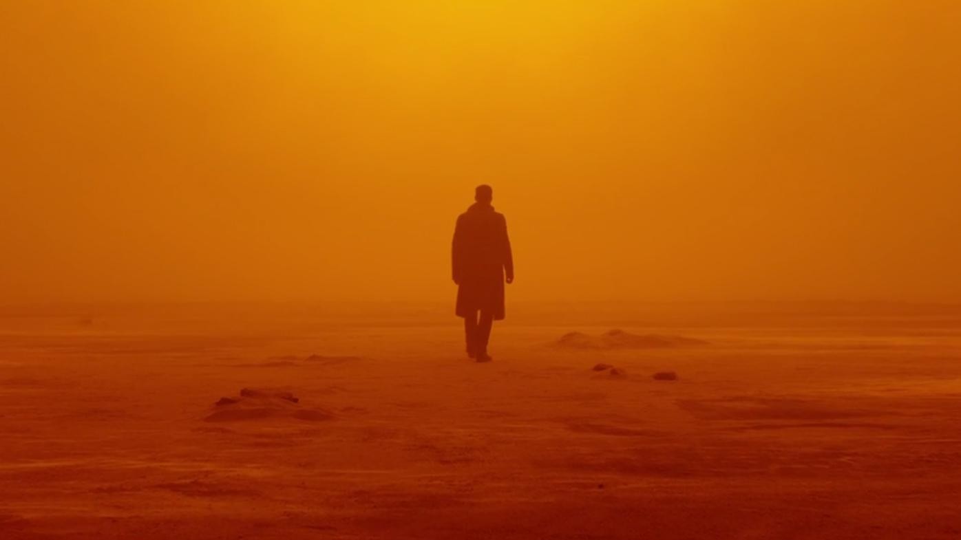
Once K gets to Vegas, the entire city is bathed in a mysterious orange fog that continues until he leaves this setting. Using this color as a backdrop creates a sense of warning and caution. Often associated with transformation, this scene acts as a transition between act two and three as our hero meets Deckard, leading to another big reveal that K has been searching for.
Green
Villeneuve uses green almost every time Joi, K’s robotic companion, is on-screen — as well as anytime we see one of Wallace’s creations. Green typically connotes life and vibrancy, which only plays to how the Blade Runner franchise explores the idea of “life.” You could also take the above scene as an example of using green to convey discovery. K is looking for answers, as his lifeless girlfriend helps from his side. Even though every aspect of his life is artificial, it’s under the disguise of appearing real.
Pink and Purple
Pink and purple are often associated with extravagance, ambiguity, innocence, romance, and overall…harmlessness. So it’s fitting that Villeneuve uses this color to represent the romantic interests to K. (Even if the romantic aspect is clearly manufactured by the world around him.) These hues serve as an almost ethereal break from the horrors happening to him. It’s only in these moments towards the end of the film that K realizes his true purpose or calling. One could look at this use of color as a way to bridge the gap between the orange hue of Vegas, to the brutal blues and white of whats to come.
White
White, representing truth and information, appears in any scene when K comes close to figuring out who he really is. The girl child and her home are bathed in white, representing a beacon for K. Toward the end of the film, K and Deckard approach the building where all the answers will come to light, and what do you know, it’s snowing outside and the building is white.
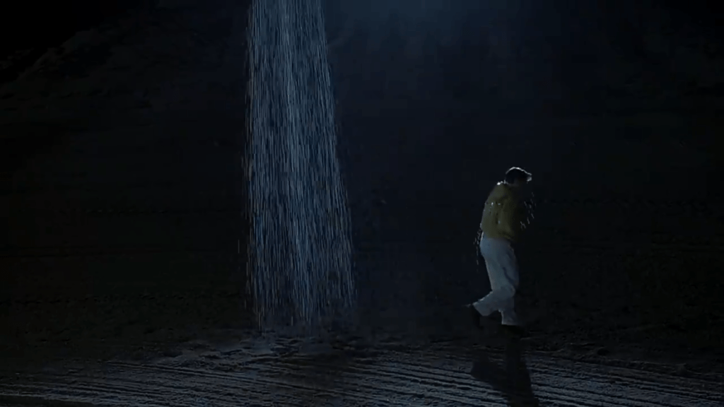
Requiem for a Dream
Director: Darren Aronofsky – Cinematographer: Matthew Libatique – 2000 – Drama / Psychological Thriller
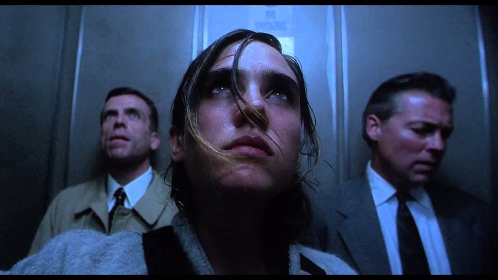
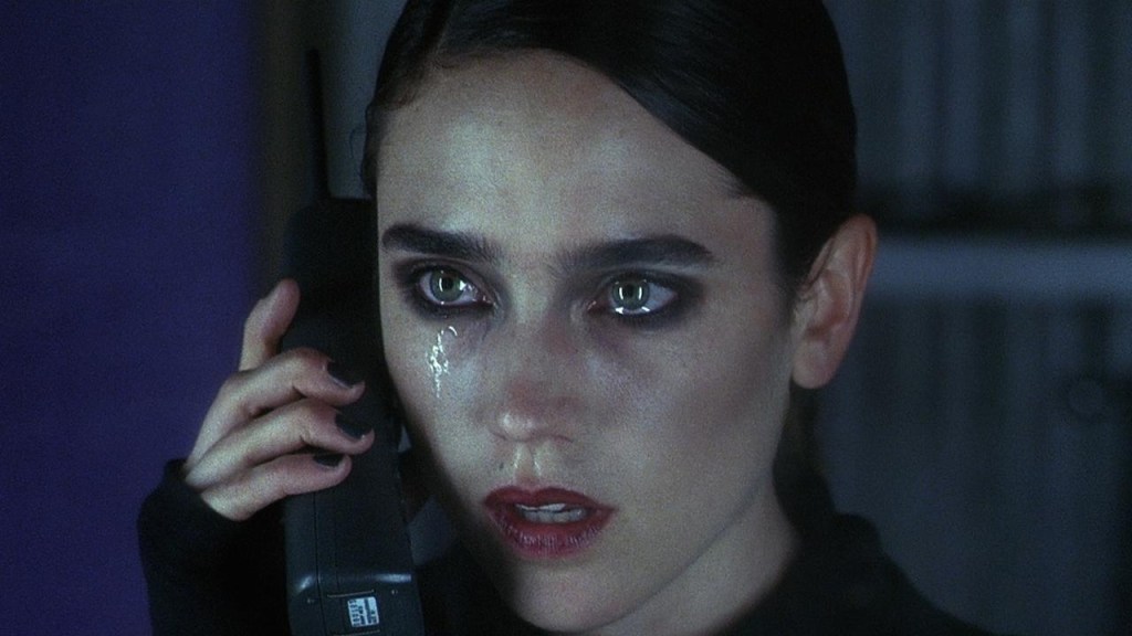
A requiem is, loosely, an act of remembrance for something departed and follows four main characters as they spiral due to addiction. Though the film is narratively structured in three parts (summer, fall, and winter), Lewis Criswell’s video essay, The Structure of Self-Destruction, maintains that the “core ideas are manifested by its violence acceleration of intensity.” The structure of the film is linked to its editing, camera, and sound design, all working together to weave an interconnected tale of four connected characters. And then, one by one, it leaves each of them alone.
The technique captures the experience of addiction by finding its cinematic objective correlative. The use of the fast montage is, For example, the characters spend so much in the search for relief from addiction that when they finally get it, “the effect of montage makes it pass so quickly that there’s no time to enjoy any of the temporary enjoyment.” This, in turn, distorts their perceptions, driving the editing and camera work. The same wide-angle shots emphasize movement, capturing internal states as the characters move through space, either lurching, running, strung out, or tense. And because the camera is attached to the actors, we cannot look (nor get) away from them, in much the same way as they cannot get away from themselves.
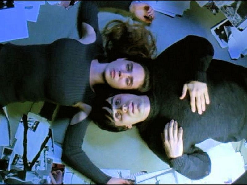
Personal Reflection:
From this film I get the impression of being in a dreamlike state throughout the whole thing. It ends in tragedy much like a nightmare or like getting killed in a video game. the camera angles and techniques help to communicate this feeling the audience gets- where you feel completely encapsulated on how each character is feeling as they desperately fight for substances and inevitably spiral into mania.
I was captured by the colour story to show reliance, vulnerability and fury. The light and dark scene transitions give me the impression of dreaming as opposed to night time and struggling. I wonder if i could incorporate the mood and tone this film creates. It has a lasting impression on my which i would like to carry on through my project.
.
The Truman Show
Directer: Peter Weir – Cinematographer: Peter Biziou- 1998 – Comedy/Drama


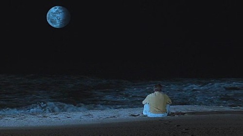
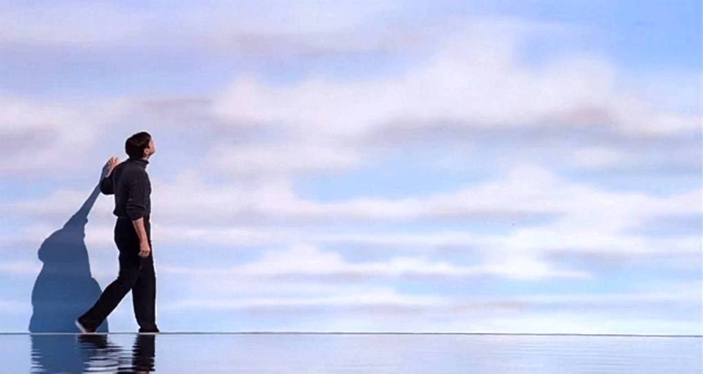
Storytelling Through Cinematography
Personal Reflection:
I love the dream like quality the film projects. Truman is living in a too perfect world and throughout the film we see the barrier falling down as he discovers his life has been a lie (staged).
.

Artists
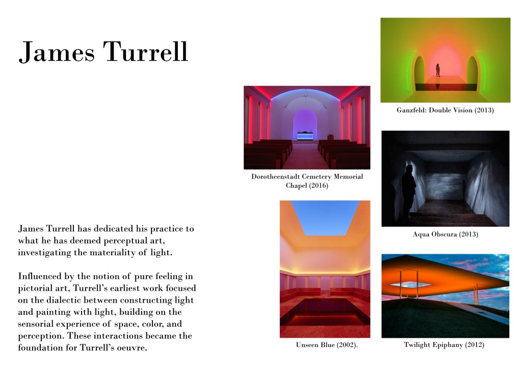
Reflection:
I love Turrell’s investigation of light as his primary material and the diversity of the affects he creates in his installations. To draw from sensory experiences, colour and perception is inspiring to me as a designer. To incorporate some of the aspects and concepts behind his work I would like to incorporate through this project. His works are cinematic pieces of art which viewers can experience first hand and not behind a screen. His piece “Aqua Obscura” is especially captivating to me as its so moody and I studied this technique and created my own camera obscura. But to create this projection with the shape and reflection of water is very tasteful and especially immersive.
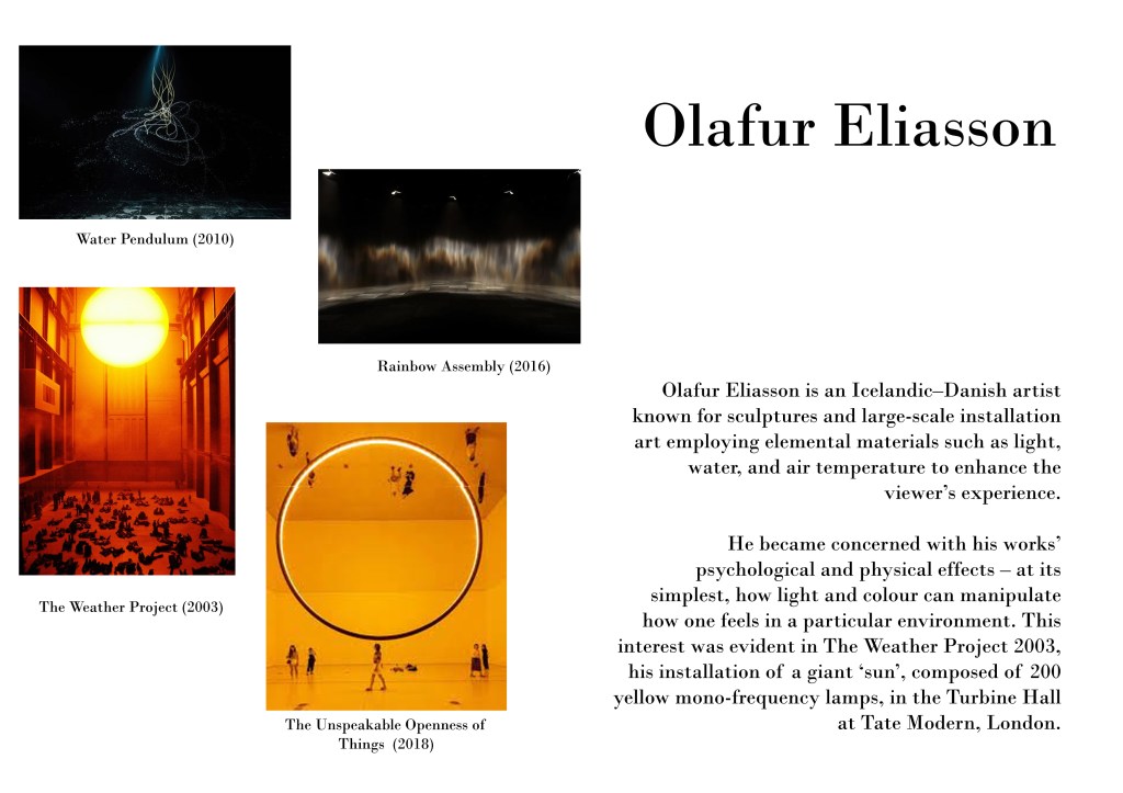
Reflection:
I am mesmerized by many of Eliasson’s works. I love his flexibility in media and colour tones to create very contrasting and heavy moods to immerse the public in his installations. The vibrancy in “The Weather Project” and “The Unspeakable Openness of Things” is very captivating – as you can see the public is completely in awe and taken by these pieces. The circle is a symbol of many things which can represent the simplicity, infinity, solar systems etc. I would like to use light, colour, projection and provoke emotion as he does as I aim to execute day to night- life to death transition.

Reflection:
I love the geometry, symmetry and colour harmony that Okeowo uses. It gives ne the impression very much of daytime and highlighting the simplicity in the beauty of the day, and as portals to a new day. The light qualities are also present as he uses shadow and reflection to create a sense of warmth with the contrast of warm and cool colours. I am considering drawing aspects of his work to communicate the daytime aspects in my day to night transition sequence through my Fort Lane installation.
